

How you approach website design for your ecommerce business tremendously impacts the results you can expect to achieve. A beautiful, user-friendly online presence encourages conversions. However, a clunky, difficult-to-navigate site is almost guaranteed to result in a bounce and harm your brand’s reputation.
But while you may be investing your time, energy, and resources into perfecting your homepage or product pages, remember that ecommerce category pages make up one of the essential steps in the buyer’s journey.
Yes, most product listing pages (PLPs) look simple enough — all they do is show the items your buyers can choose from. Nonetheless, you can still employ UX design to make them look and perform better (and inspire more conversions).
To help you get the most out of these assets, we rounded up the UX best practices that boost conversion rates on ecommerce category pages. Let’s dive in.
Choose a Mobile-Friendly (and Adjustable) Layout
Nothing frustrates web visitors more than a page that doesn’t display well.
Research shows that 30% of people will stop interacting with content that doesn’t display well on their current device.
Furthermore, as you explore UX design strategies for your website, remember that over 50% of all web traffic comes from mobile devices. And seeing how different screen sizes necessitate different layouts, you must do your best to choose one that will work for your web visitors.
The good news is that you can significantly improve user experience on your ecommerce category pages by opting for a mobile-friendly page layout. However, if you want to take things to the next level and guarantee your audience has a pleasant time browsing product listings, allow for some adjustability.
To see a great example of this UX design strategy, check out the Cardigans and Sweaters page on the Mango website. In the top right corner, you’ll notice an option that lets visitors choose whether to show 2 or 4 garments per row. This gives shoppers control over how big each item appears. Moreover, it allows them to jump into the product evaluation process without wasting time navigating between product pages or forcing them to open multiple tabs to see each garment.
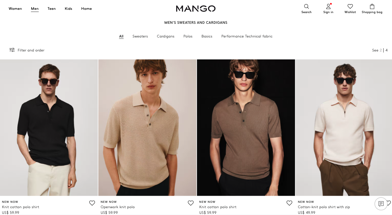
Source: mango.com
Don’t Distract the User with Too Many Filter Elements
Allowing users to filter results based on their preferences and needs is crucial when designing ecommerce category pages. But if you want to guarantee a positive UX experience, resist the temptation to clutter PLPs with too many UI controls. Otherwise, you’ll overwhelm potential buyers and cause them to become frustrated before even looking at the products in your offer.
If you must include multiple filters to ensure your audience has the necessary tools to choose relevant products, consider user-friendly ways to reduce visual clutter. Creating a seamless browsing experience in a digital merchandising platform involves optimizing filter functionalities to minimize visual clutter while empowering users to find products that meet their preferences
For instance, if you check out the Composite Wall Cladding page on Ovaeda, you’ll see that it includes dozens of filters. But, to prevent these from detracting from the user experience, the brand collapses the choices based on a few broad categories like color, type, or price.
This is a smart way to make the product browsing process more enjoyable for Ovaeda’s customers. It also minimizes the number of unnecessary visual elements on the page, allowing shoppers to focus on the products instead of wasting time navigating a complex UI structure.
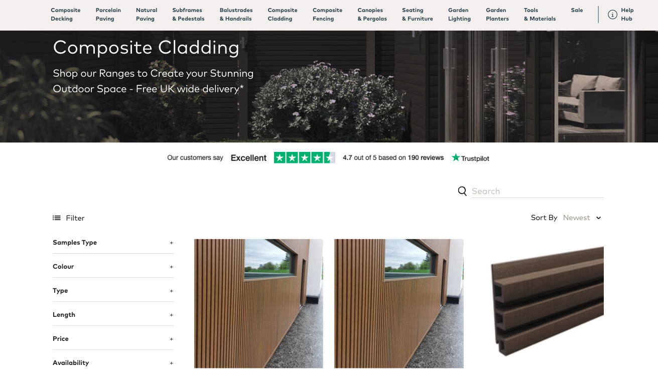
Source: ovaeda.com
Pick Thumbnails That Capture the Shopper’s Attention
Visuals are crucial during the product selection and evaluation process. According to research, 75% of shoppers rely on product photography to make buying decisions. And even more importantly, 60% of consumers consider high-quality photos the most critical factor during shopping.
So, if product photos are essential for boosting conversion rates, the one UX design hack you need to implement on your PLPs is to use visuals that capture the shopper’s attention.
In addition to choosing high-quality photos that show off the products in an attractive way, consider other ways you could capture your audience’s attention with thumbnails.
For example, Greenhouse Emporium does something quite creative on its Greenhouse Kits page. The brand shows off its products already deployed at a customer’s property. This doesn’t just help buyers visualize the solutions in their own homes. It makes these large objects easier to evaluate by allowing buyers to see how they look relative to other common backyard elements.
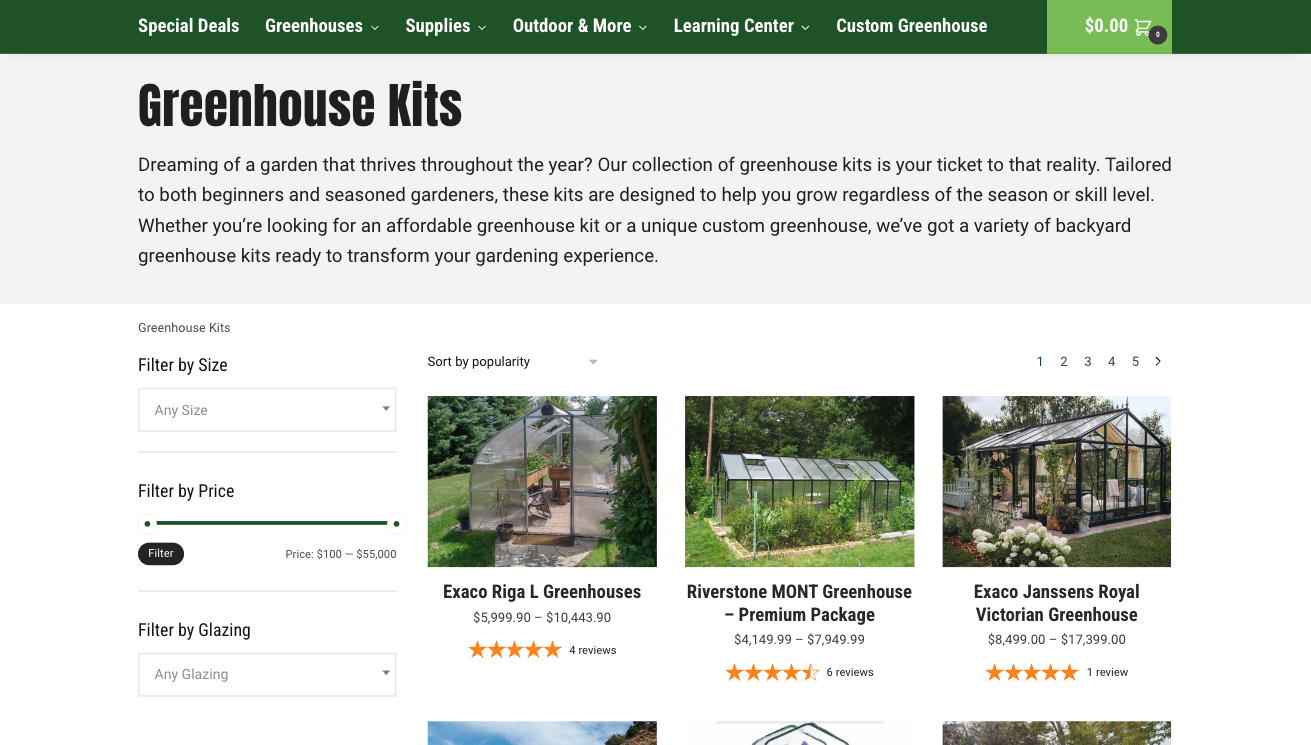
Source: greenhouseemporium.com
Enable the Shopper to See More than One Product Angle
Apart from populating your ecommerce category pages with attention-grabbing thumbnails, don’t forget that one product photo most likely isn’t enough to convince your audience to convert.
Instead, your buyers will want to see at least three to five product snaps (from different angles) to make a purchasing decision they’re comfortable with.
Admittedly, PLPs aren’t usually where people look at product images. Nonetheless, one UX design trend that’s been picking up is to enable shoppers to see more than one product angle on collection pages.
For example, Jacques Marie Mage allows shoppers to pick between product colorways on its Icons product collection page.
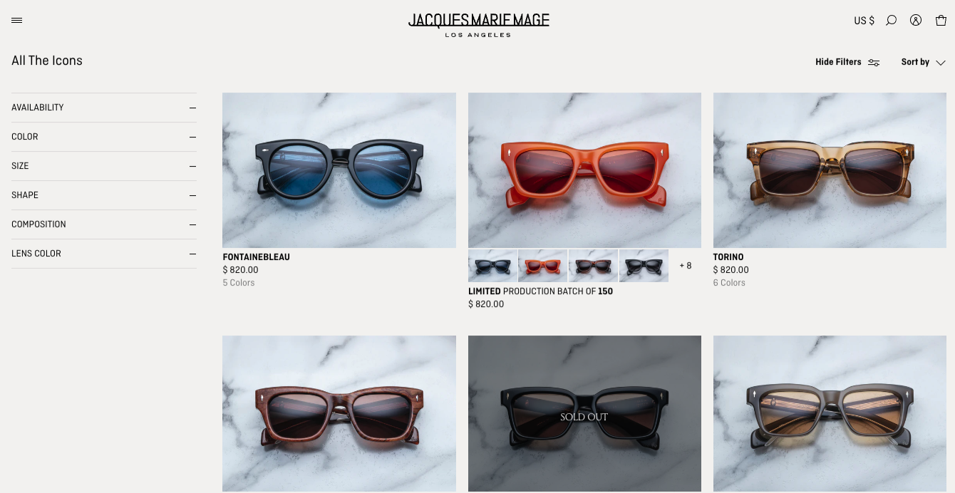
Source: jacquesmariemage.com
Simply Beach provides an alternative product view on mouse hover on its Women’s Swimming Costume page, allowing users to see how a swimsuit looks from the back.
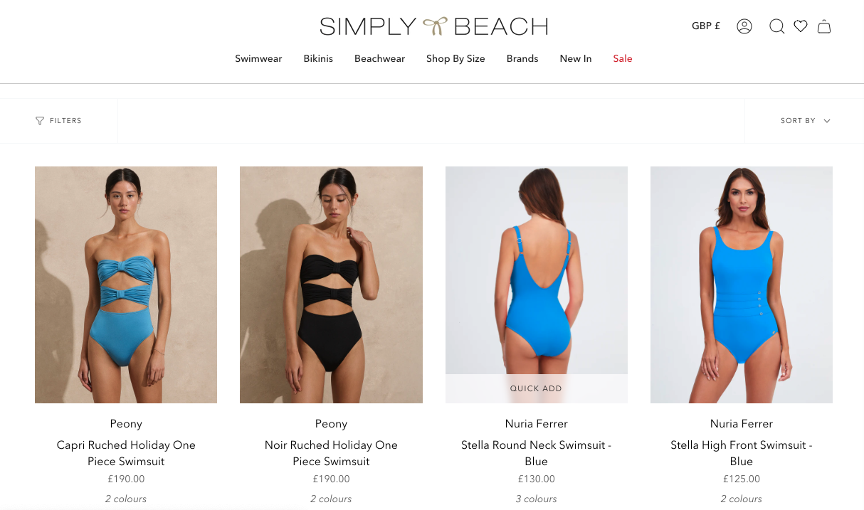
Source: simplybeach.com
And brands like Loewe fully embrace this UX design strategy. Loewe allows customers to see one alternative view and browse all the available product photos straight from the Men product category page. This makes the product evaluation process possible without forcing buyers to visit specific product pages.
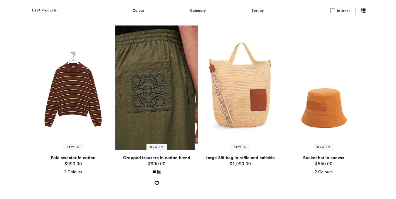
Source: loewe.com
Don’t Forget about Social Proof
As you already know, social proof is crucial for people in the process of making shopping decisions.
Research has shown that 99.75% of consumers read product reviews at least sometimes. But even more importantly, 98% of people consider social proof a crucial resource for making purchase decisions. With this in mind, you’ll want to look for ways to upgrade your ecommerce category pages (and make them more likely to inspire conversions) with various instances of social proof.
The thing about implementing this UX design strategy on your ecommerce website is that you can do it in multiple ways, depending on your brand’s (and target audience’s) requirements.
For example, if you want to employ a pared-down product listing page design, doing something similar to Bariatric Fusion would be the best choice for your business. On its Bariatric Multivitamins product collection page, this brand uses the section right below the main product photo to show off a star rating and the number of reviews for the item.
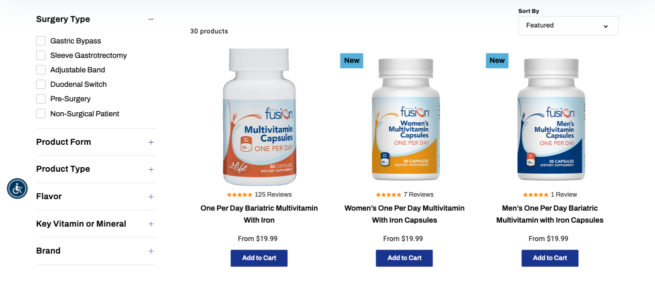
Source: bariatricfusion.com
Or, if you want to draw your prospects’ attention to the credibility of your ecommerce store, you could do something similar to the Danish Design Store. Check out the site’s footer section, which is visible on all product category pages. The brand shows off its Google rating, which is a great way to instill in buyers a sense of safety when shopping with the retailer.
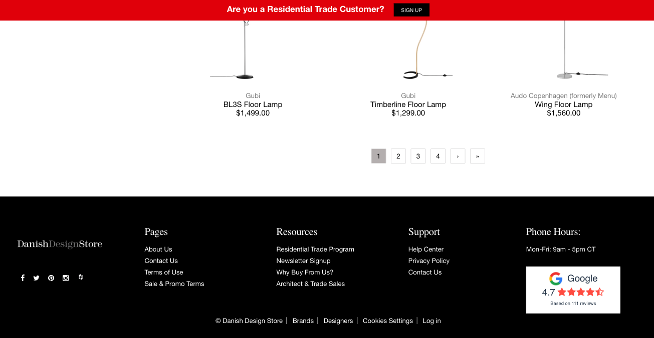
Source: danishdesignstore.com
Lastly, if you want to highlight your brand’s trustworthiness but don’t want to force web visitors to scroll to the bottom of your category pages, you could do something similar to Tiny Organics. This brand created a faux product pod on its Menu PLP, using the section to show off a testimonial from a professor of nutrition science.
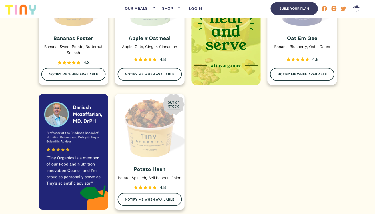
Source: tinyorganics.com
Include an Explainer Video
When running an ecommerce store (or selling any solution, for that matter), you have to ensure that your audience understands your products.
But there’s a specific point when product understanding becomes a conversion-boosting factor. You see, getting people to click the “Buy” button isn’t just about getting them to comprehend what your solution does. More importantly, you need to guarantee your customers see how your products benefit them.
With this in mind, it’s a good idea to explore UX design strategies that could boost product understanding on your category pages. If you’re searching for the most effective tactic to reach the desired effect, consider adding explainer videos to PLPs.
Whether you’re selling an out-of-the-ordinary product or have a complex delivery or assembly process, video can help you effectively communicate information and highlight user value.
For instance, check out the Custom Bike Decals page on the Vinyl Status website. This page includes an embedded YouTube video showing how decal creation works. It takes prospects through the process of ordering stickers. It points out important info like fast turnaround, shipping speeds, prices, available shapes, and additional options. And, sure, the brand could have just included this info in the page copy. However, because most consumers prefer to learn about products by watching videos, embedding this explainer is the best option for maximizing conversion potential.
Source: vinylstatus.com
Use Quick-Add-to-Cart Options
As you explore UX best practices that boost conversion rates — whether for ecommerce category pages or product pages — you need to understand that a quick shopping process is crucial for giving your customers a pleasant buying experience.
If you look at why people abandon their carts, you’ll find that 22% of consumers fail to convert due to a slow or complicated check process. What this data indicates is, of course, that ecommerce stores need to work to streamline the shopping process as much as possible. Whether that’s by allowing guest purchases or one-click checkout is up to you.
However, remember that (at least a section of) your audience might be in a hurry to buy. See if you can include a Quick Add to Cart (and a Quick View) option on your PLPs.
If you look at the Fruit Pigmented Makeup collection page on the 100% Pure website, you’ll see that the brand allows buying without forcing visitors to go through product pages. This is an excellent conversion-boosting strategy. And its result isn’t just an uptick in sales. It could also improve average order value by ensuring shoppers don’t overlook a product they want because they left the category page they were browsing.
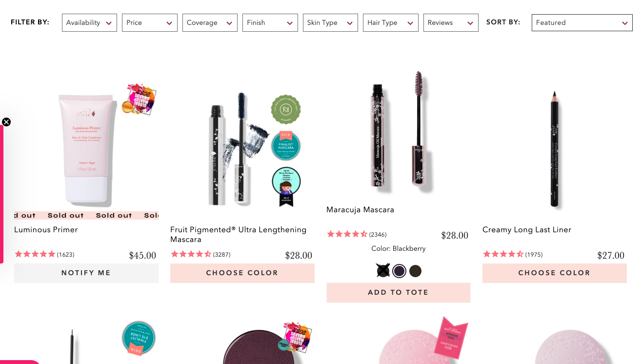
Source: 100percentpure.com
Another thing to remember as you explore ways to streamline the shopping process is that a conversion (even on an ecommerce site) doesn’t equal a sale. So don’t hesitate to include secondary CTAs (like allowing consumers to add an item to their wishlist) in your UX design.
For example, if you check out the LG Lifestyle Monitors category page, you’ll notice a “Compare” option at the bottom of each product pod. This is a marvelous UX design strategy. It helps shoppers evaluate products, but more importantly, it empowers them to make the right buying choice. This instantly elevates the customer experience, maximizes satisfaction, and contributes to customer loyalty.
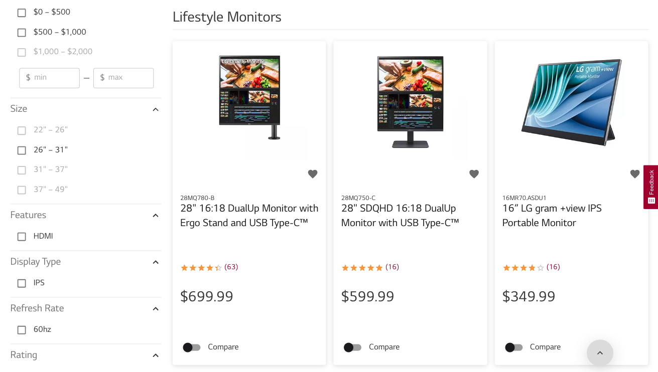
Source: lg.com
Emphasize Savings
As you explore ways to make your ecommerce category pages more effective at inspiring conversions, don’t forget to emphasize savings.
After all, today’s consumers want to get good deals. And statistical data shows that 92% of people always search for discounts and offers before buying. So, if your audience wants value for money, why not add design elements to your product listing pages that will highlight savings?
The great thing about this tactic is that it’s easy to pull off. All you need is a banner or a price anchor — like the one on the Women’s Handbags page on the Aldo website — and your potential customers will know that shopping with your brand pays off.
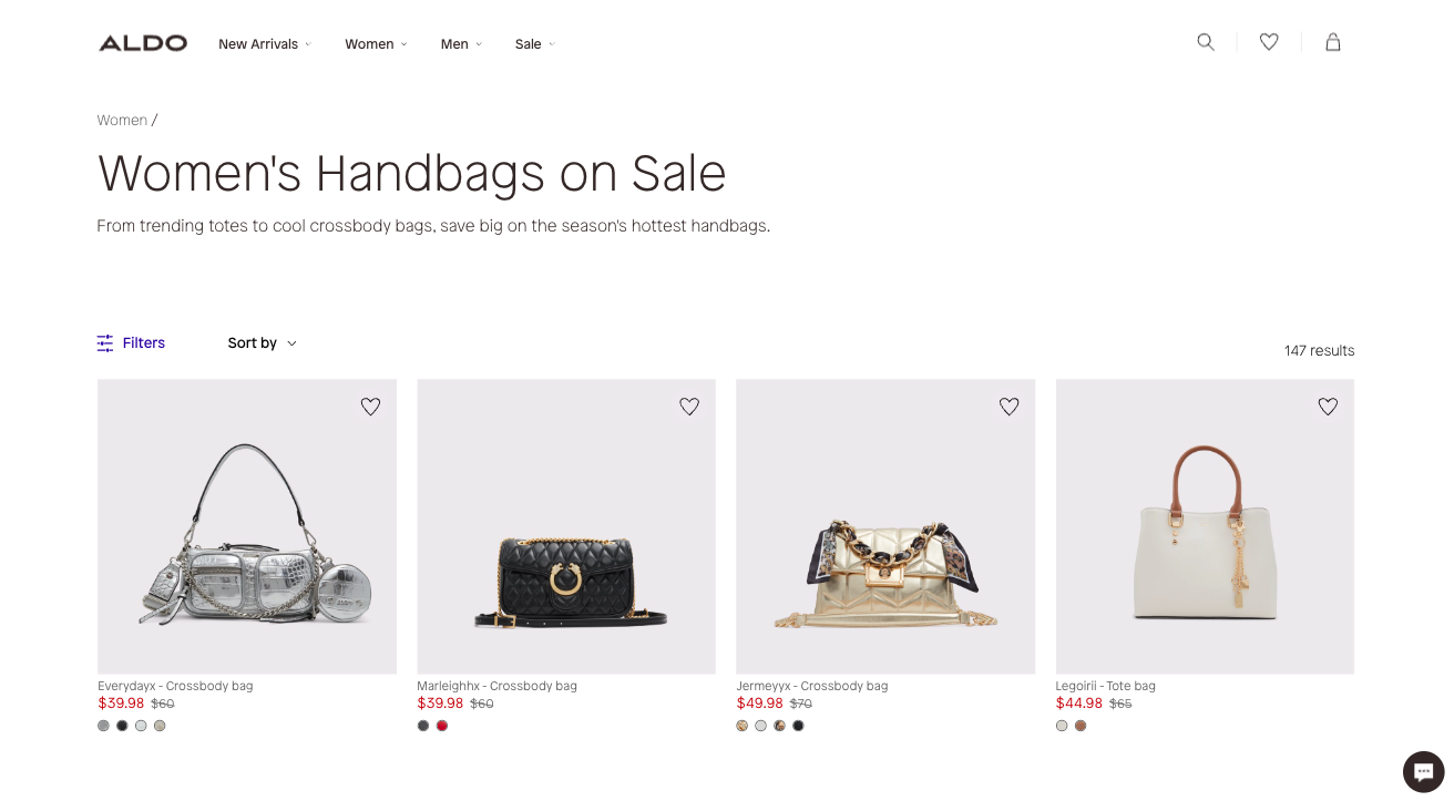
Source: aldoshoes.com
Final Thoughts
Elevating your ecommerce category pages to boost conversions is all about UX best practices. So, by following the tips from this article, you’re guaranteed to create collection pages that sell.
To maximize your ecommerce site’s conversion potential, you need to optimize product pages as well. After all, most consumers will take a closer look at a product before committing to a purchase. Nonetheless, by investing in PLP design, you’ll significantly upgrade the shopping experience, empower your prospects to make smarter buying decisions, and create an environment suited for impulse purchases.

